- Publisher's Note
- Editorial
- What's Behind This Orange Facade!
- “First you are drawn in by something akin to beauty and then you feel the despair, the cruelty.”
- Art as an Effective Tool against Socio-Political Injustice
- Outlining the Language of Dissent
- Modern Protest Art
- Painting as Social Protest by Indian artists of 1960-s
- Awakening, Resistance and Inversion: Art for Change
- Dadaism
- Peredvizhniki
- A Protected Secret of Contemporary World Art: Japanese Protest Art of 1950s to Early 1970s
- Protest Art from the MENA Countries
- Writing as Transgression: Two Decades of Graffiti in New York Subways
- Goya: An Act of Faith
- Transgressions and Revelations: Frida Kahlo
- The Art of Resistance: The Works of Jane Alexander
- Larissa Sansour: Born to protest?!
- ‘Banksy’: Stencilised Protests
- Journey to the Heart of Islam
- Seven Indian Painters At the Peabody Essex Museum
- Art Chennai 2012 - A Curtain Raiser
- Art Dubai Launches Sixth Edition
- "Torture is Not Art, Nor is Culture" AnimaNaturalis
- The ŠKODA Prize for Indian Contemporary Art 2011
- A(f)Fair of Art: Hope and Despair
- Cross Cultural Encounters
- Style Redefined-The Mercedes-Benz Museum
- Soviet Posters: From the October Revolution to the Second World War
- Masterworks: Jewels of the Collection at the Rubin Museum of Art
- The Mysterious Antonio Stellatelli and His Collections
- Random Strokes
- A ‘Rare’fied Sense of Being Top-Heavy
- The Red-Tape Noose Around India's Art Market
- What Happened and What's Forthcoming
- Art Events Kolkata, January – February 2012
- Mumbai Art Sighting
- Art Bengaluru
- Delhi Dias
- Musings from Chennai
- Preview, February, 2012 – March, 2012
- In the News-February 2012
- Cover
ART news & views
Soviet Posters: From the October Revolution to the Second World War
Issue No: 26 Month: 3 Year: 2012
Collectible
by Anurima Sen
'During World War I posters bloomed on the walls of buildings in Russian cities on an unprecedented scale. In the beginning, they called for donations to charities, invited people to benefit exhibitions and concerts, and drew attention to new films featuring the war's horrors and atrocities. Later the government issued posters asking for subscriptions to war loans. A relatively new medium in Russia, posters experienced their first boom during World War I.'
- From Hubertus F. Jahn's Patriotic Culture in Russia during World War I
That was a short but apt description of how Soviet posters became a rage, a talking point, and subsequently a collectible, post the First World War. Their relevance cannot be confined to the era in which they evolvedthe historical value of the wartime posters' messages cannot be undermined.
In the pre-War era, posters were limited to advertising medicines, events, goods and services. The influences were mainly European, borrowing especially from the works of Alphonse Mucha who dabbled in art nouveau poster-making traditions. Patriotic posters first surfaced when private organisations such as the Red Cross and the Zemstvo Union joined hands to raise funds for soldiers serving in the army. Those posters were targeted at the masses, urging people to participate in street collections of money, clothing and other necessities. According to Frank Kampfer's model, these posters can be divided into three categories: text based posters, those containing a visual element but overshadowed by the written message, and those that bear a strong visual element with some related text. It is obviously the third category that has captured the attention of collectors most.
A noticeable trend in posters (dating back to 1914 and 1915) is that they often use idyllic scenes to illustrate sentimental themes, and in this case, making donations for charitable causes. Jahn writes, “These posters drew upon the traditional styles of lubok art, realistic painting, and national heraldry; abstract art and Western art nouveau had little influence. At a stylistic level, then, war relief posters were quite conservative, in keeping with the wide and artistically unsophisticated public they aimed to reach.”
In 1916 the Russian government started the war loan drives, and posters were used effectively to appeal to the citizens' sense of civic duty and the need for economic sacrifice. These war loan posters were the first official propaganda posters produced in Russia and hence the homespun look of the lubok artwork gave way to large-format chromolithographs in striking, contrasting colours.
Jahn makes a note of two posters for their unusual scenes. Rikhard Zarrin's poster shows a good looking young man at his workbench, executed in a simple fashion, predominantly in yellow, red and black. In another similar (unsigned) poster, a pretty young woman is engaged in industrial work. What the Petrograd posterist has created is an ideal amalgam of upper class ideals of beauty and the notion of the dignity of work.
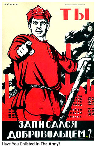 Poster-making in Russia took another turn in the second half of 1918, when all of a sudden, posters became the chosen mode of communication for every Soviet agency responsible for indoctrination, such as local Soviets, commissariats, and mass organisations. This period of poster-making (1917-1921) is commonly called the Bolshevik Era and it epitomized the struggle for Bolsheviks and their central ideologies. Hence, the posters were brimming with revolutionary fervour and a spirit that was unparalleled. The most important poster artist of this age was Dmitri Moor. He single handedly changed the face of graphic design in Soviet Russia in 1918. Most of us are familiar with his Have You Enlisted in the Army? poster. It bears an image of a Red Army soldier, rising amidst fumes of black smoke emitted from the factory smokestacks in the background and bluntly questioning the reader about his contribution towards the nation during the October Revolution. Moor's agenda is to create a stark contrast between the good and the bad, or the enemy and the allies. Russian workers were being prompted to rise against Imperialism and embrace the cause of the Bolsheviks. During the Bolshevik Era most artists limited themselves to the colours red, black and white. Red, obviously, had a symbolic relevance in their quest and hence it was used for socialist elements such as flags, caps and workers' uniforms. However, a change in this usual style is seen in a poster that appealed for help for the victims of the Russian famine in 1920. It shows the figure of a skeletal old man who spreads his hands in despair, possibly praying for help. The poster beards a single word'pomogi' (translated, it means help).
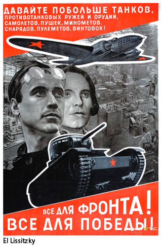
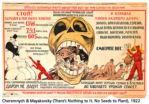 Now consider the posters by Nikolai Pomansky, Aleksandr Rodchenko, Cheremnykh and Mayakovsky: all of them are boldly executed in red and black strokes with bare yet striking illustrations that hit home. Rodchenko's work for Dobrolet (The Russian Volunteer Air Force Society) is a clear example of how avant garde art had influenced the art of poster-making. It graphically represents the flight path from Moscow to Ivanovo-Voskresensk to Nizhny Novgorod in simplified colour and geometric forms. It has quite aptly been described as a 'Modernist milestone'. El Lissitzky was also responsible for changing the look of typography as seen on posters, and his influence quietly permeated all realms of art. His posters were also propagandist in nature, urging workers to help rebuild the nation.
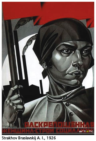 The next era of poster-making (1921- 1927) cover the years of the New Economic Policy. The strict measures undertaken by the government speeded up the process of recovery in a nation that was almost plunged into despair after years of battling debt, war and famine. Strakhov Braslavskij is one artist who deserves special mention because of his posters that promoted the emancipation of women. After years of suppression, this period promoted the notion of gender equality and emphasized upon the importance of education amongst women. Educated and emancipated women were considered to be supporters of the Red Army and their ideology. His 1926 work, titled Emancipated Woman- Build Up Socialism, is a clear indicator of how Socialism and women's liberation were considered to be thoroughly entwined. The poster shows an androgynous woman in a very masculine garb. In the background, factories loom large as a constant reminder of how both men and women were expected to participate in heavy industrial work in equal measures. Her eyes are stone-cold, almost emotionless and her jaws are set with grim determination. This particular portrayal of the post Revolution woman has also raised a lot of questions regarding the masculine idea of women's liberation: is it simply a strategy to slowly transform women into men by suppressing their feminine characteristics, instead of truly emancipating them?
These six years (also known as the 'roaring twenties') were both exciting and progressive as far as the arts was concerned. The Constructivist movement gained momentum and began to influence all works of art and literature. They fully rejected the theory of 'art for art's sake' and embraced the cause of 'constructing' a new communist society. One also needs to mention the film posters of the era with their unusual and striking use of new techniques such as photomontage, double images, intercutting, split screens and freeze frames. Take a look at the film poster for the first Soviet science fiction film, Aelita, which had its sets designed by none other than Rodchenko. The use of both imagination and colour is striking, hinting at the creative license given to artists of this period. Artists such as Georgii and Vladimir Stenberg, Nikolai Prusakov and Mikhail Dlugach gained eminence during this period.
Valentina Kulagina was one of the few female poster artists who emerged in the 20th century. Heavily influenced by El Lissitzky, her work incorporates a cubist perspective as seen in the poster called To Defend USSR. The marching Red Army is represented as larger than life robots, oblivious to the royalists (in white cardboard planes). The giant red soldiers are a depiction of the Soviet Might.
Posters were used extensively once again during the years of the Second World War. The August 1942 issue of Life magazine carried a colourful article on these posters and illustrated how the figure of cows was used by the Russians to symbolize the Nazis. The subject of these posters was topical, and was picked from the daily war news by a board of writers. Poets supplied catchy jingles while the artists drew caricatures of Hitler and the Nazi party. These posters would probably appear to draw heavily on typically lurid monotones, garish contrasts and very defined and often, exaggerated features that bordered on the cartoonish. However, it must be remembered that representing artistic (or aesthetic) veracity was not the primary objective of these posters, and to that end, these posters succeeded exceedingly well. One of the earliest trends seen in the Soviet posters of this era represents an important section of the Great Patriotic War of 1939 to 1945. Posters became iconic, drew heavily on symbolic imagery and became a throwback on the early Bolshevik posters of yore. Eminent examples could be seen in the work of Kukryniksy, where the posters employed a formed of skewed realism to convey a litany of attacks on Hitler in particular and the general philosophy of Nazism in general. A notable example of this semi-comic style could be seen in the poster Lies Machine Gun, by Kukryniksy, which depicts an enraged Hitler spewing out propagandist leaflets from a machine gun which looks startlingly like Joseph Goebbels, the infamous Nazi minister for public affairs, arts and propaganda. The poster is a direct reminder of the carnage at the Battle of Rzhev, from 1942 to 1943, substituting the actual nozzles of machine guns with the far more potent (as an unfortunate metaphor) propaganda initiated by Hitler. A far more menacing graphic, however, is seen through Nina Vatolina's simplistic portrayal of the repression of freedom during the World War II. The poster shows a working woman in her kerchief, holding a finger to her lips in a universal sign of alacrity and danger. The poster calls for increasing local vigilance, bracing citizens for any imminent danger during those turbulent times. The poster background is a simple cream shade, on which the poster (and a verse) is emblazoned in bright red colours, bringing out the sense of urgency and danger in the poster. The verses written in the poster are of Samuil Marshak, a Soviet poet who is known for writing numerous verses and short stories for children. The poster has become a highly sought-after collectible in the wake of the World War II the world over, because of its essential portrayal of the realities of war. This poster was intended to be a single issue, yet however, brings into notice the older poster by Valentina Kulagina.
Around the World War II, Soviet poster-making saw a paradigm shift where Stalin favoured a more Realistic style to the national posters. The artists were young, impressionable painters, the more famous of whom are Irakli Toidze, Koretsky and Kukryniksy. By the end of World War II, the typical Soviet poster would still be done in the realistic style, with the exception that now, the themes of the posters would cease to be military or martial, and posters would now emphasize the civilian sphere. One of the main tropes from this age would be widespread social reforms, and the representation of a utopian society and political harmony under Stalin. This shift could be seen from a purely artistic point of view as well, as posters began eschewing the more dynamic colours like red and black in favour of softer shades like green and blue and yellow. Popular themes for posters were all-round development and welfare work done in the various Soviet cities, the prosperity of the countryside and the domestic produce, and the advancement of science and technology in this period. Occasionally, the posters would be self-congratulatory, like Viktor Koretsky's 1947 Long Live the Armed Forces of the Soviet Union. This poster show an airman, an infantryman and a naval officer proudly looking on, with the party emblem CCCP flies at their back. Another poster from this very series (this one indeed could be called its legitimate predecessor) is called To the West, by V.S Ivanov, and shows a victorious Soviet soldier making his way to the west in a direct antithetical stand to the German slogan Drang Nach Osten (drive towards the east).
However, as said earlier, the focus of the typical soviet poster changed steadily post the WWII, to encompass a more peaceful world of science and progress. Space travel and scientific explorations become a recurrent trope in many posters like A. Sokolov's famous poster Glory to the Explorers of Space, 1971. Another trope countered this exact popular imagination in Soviet artworks, with posters coming to realize the vagaries of science through its more visible manifestations like pollution and environmental damage. A sterling example of this would be Gavrilov's seminal poster Do Not Pollute Reservoirs with Oil, in 1959 a poster concerning itself with oil spillage, and its effect on the environment. While less-pronounced than the war posters, these posters also serve to equate the Soviet artistic consciousness with a very visual tradition, where everything, from martial legacies to sports achievements (Reshetnikov's 1962 poster USSR is a mighty sports power) is celebrated on a publicly-accessible visual medium, the poster. It perhaps is justified that the Soviet posters are the quintessential representatives of their own unique proletarian identity, one that could be easily replicated, reproduced and spread out across the cross section of the populace.